
- This event has passed.
Memorable Stop
28 May 2020 - 10 Jul 2020
Event Navigation
Stop.
A memorable typeface
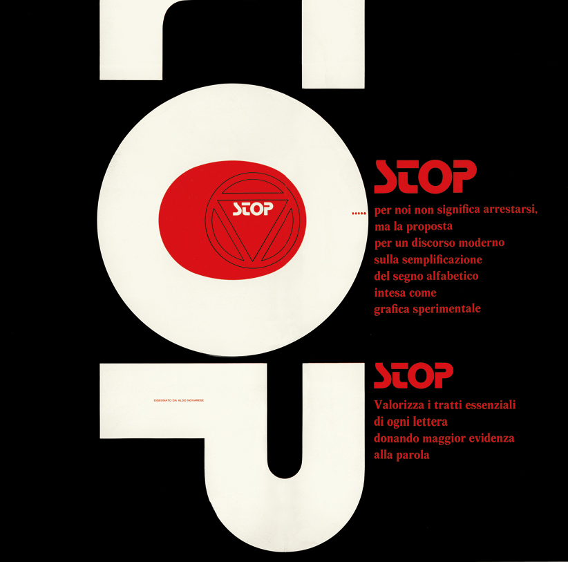
Stop
design by Aldo Novarese
Nebiolo type foundry, Turin 1970
photo credits
Archivio Tipografico, Turin
Tipoteca Italiana
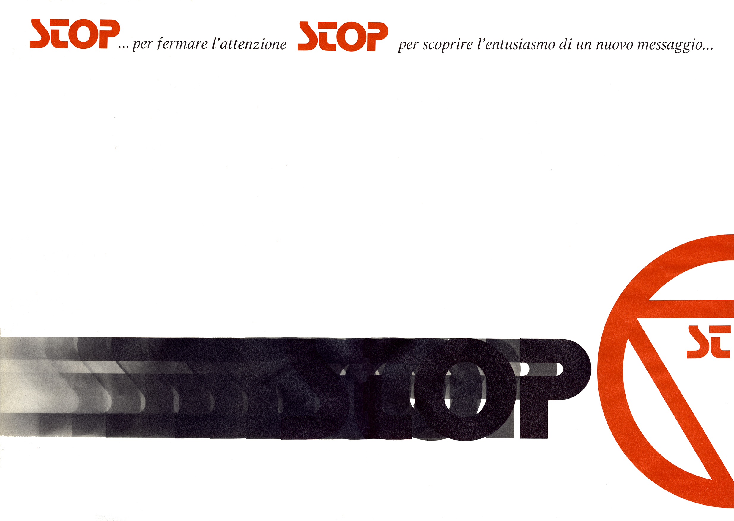
In 1970, the Nebiolo type foundry in Turin released one of the last typefaces produced in metal, destined for unpredictable success by virtue of its design that has become “iconic”.
We’re talking about Stop by Aldo Novarese, a top designer of the Turin foundry.
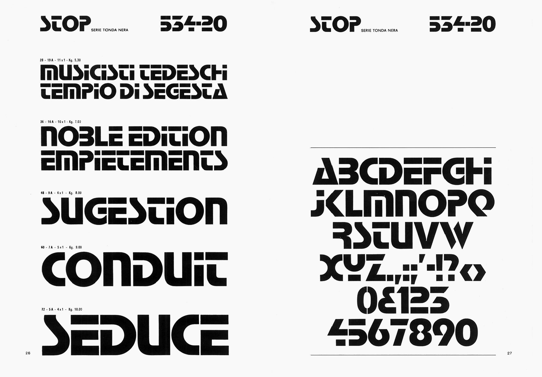
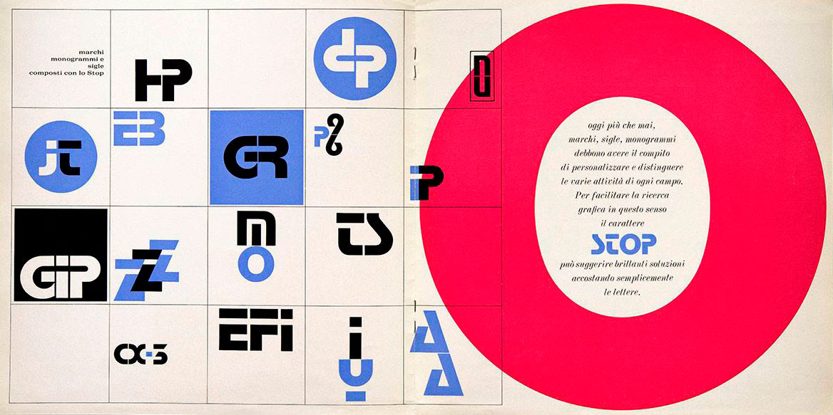
Stop was launched on the market as a “new alphabetical sign… in the quest for new graphic ideas”. The peculiarity of its design lies in the extremely stylized shapes of the letters, the result of a smart and calibrated process of subtraction and synthesis: in other words, it is a font specifically designed to make attractive logos, initials and monograms.
We are daily overwhelmed by contexts full of typography, to the point that experts often speak of ‘visual pollution’. For most people, the shapes of the letters are “transparent”, in the sense that everyone is led to read the message without giving too much weight to the formal aspect of the signs that compose it. It mostly happens with text characters.
Stop, on the other hand, stands out thanks to the unmistakable recognizability of its shapes, exclusively upper case, therefore suitable for the linear composition of logos and brands.
In the history of type design there are illustrious precedents of similar characters that we could define as “experimental” even if they are modernist because they expand the limit of readability to the extreme. The typefaces of Josef Albers and Herbert Bayer, and the Bifur, a modular geometric sans designed by A.M. Cassandre in 1929 for the French foundry Deberny & Peignot.
The next time you read the sign of an auto body shop, the tarpaulin of a truck, the brand of a bus company, try to recognize if the fonts in use are precisely the shapes designed by Novarese for Stop. We can rightly consider it – nomen omen – a fixed point in the typographic firmament.

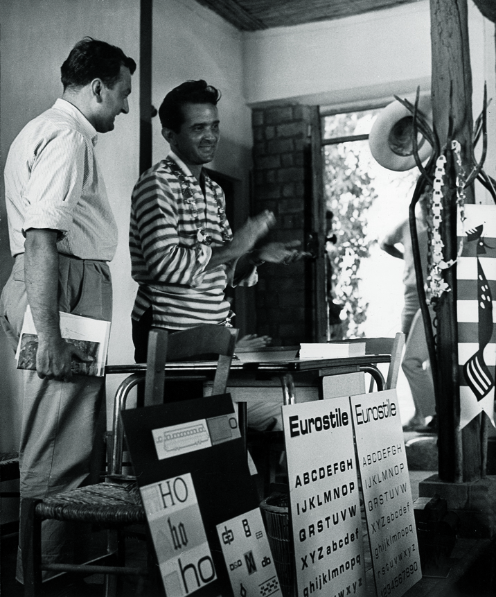

Aldo Novarese (1920–1995) was one of the most prolific type designers of the 20th century, having designed over 100 type families—some 30 of these at Nebiolo type foundry in Turin. His professional career started first (1936) as a draftsman at the Nebiolo, then as the director of the Artistic Studio from 1952–1975, and later continuing as a freelance designer. His typefaces are part of the visual heritage and urban ‘landscape’ of Italy. Among his popular designs, we just mention Estro, Egizio, Recta, Magister, Garaldus, Forma, and, of course, Stop.